
Ever wonder why some rooms just feel right, while others feel off—even when everything “matches”?
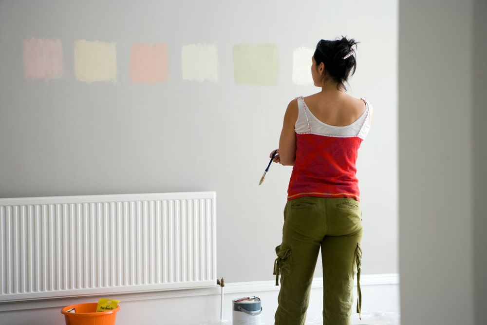
Ever wonder why some rooms just feel right, while others feel off—even when everything “matches”?
You might think the problem is your furniture or layout, but often, it's your color palette working against itself.
The truth is, traditional color theory doesn’t always work for real-world interiors. Designers don’t use pure red, blue, or green—they use layered, nuanced, emotional tones chosen in context.
In this article, you'll learn 6 tricks professional designers use to combine colors that feel intentional, balanced, and personal. From emotional cues to the 60-30-10 rule, these tips will help you build a home that not only looks beautiful, but feels like you.
Color combination is one part of a broader design framework — if you want the bigger picture on what makes a home feel cohesive and intentional (not just colorful), our interior design principles guide is worth reading alongside this one.
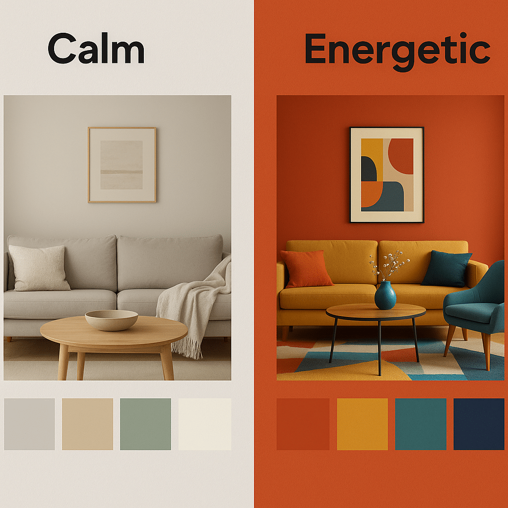
Color is emotional first, technical second. That’s why designers begin with how a space should feel—not just what looks good on a swatch.
Ask yourself:
How do I want to feel when I walk into this room? Calm and relaxed? Energized and bold? Cozy and grounded?
Choose colors that evoke that emotion for you. Your reactions to color are personal and may be shaped by culture, memories, or even your mood.
Low contrast and soft saturation create calm.
High contrast and bold saturation spark energy and vibrancy.
Bold takeaway: Start by picking colors that feel right, not just ones that follow theory.
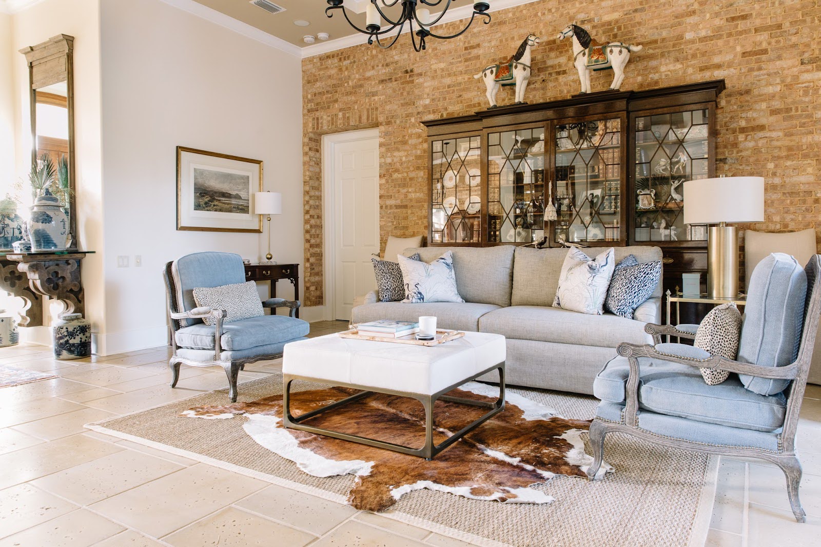
Color doesn't exist in a vacuum, it exists in relationship to everything else in the room.
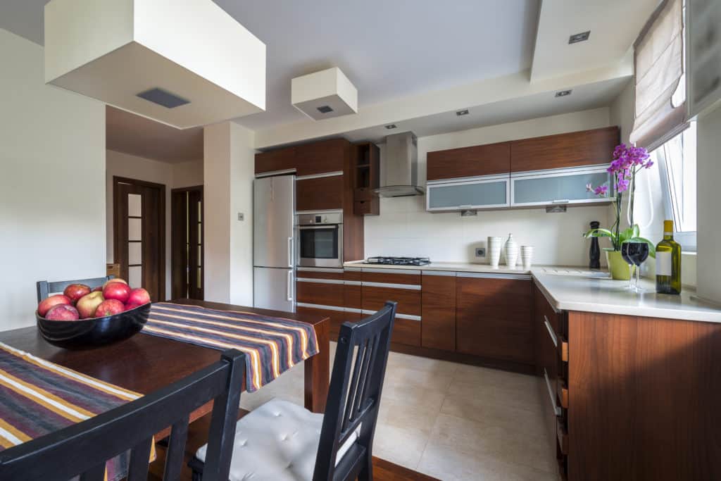
That bold red wall might feel cozy in a room with warm wood tones, but harsh against sleek, gray tile.
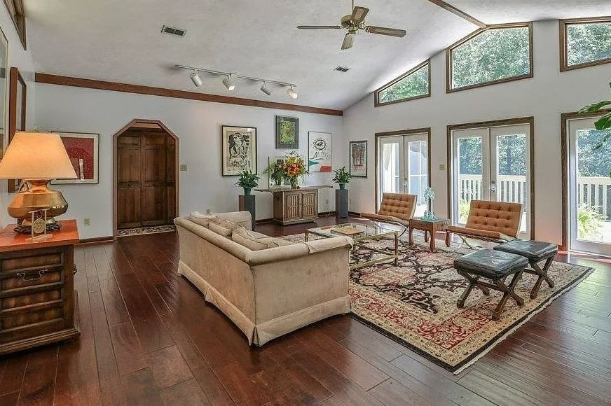
Identify your fixed finishes—like floors, tiles, countertops.
Determine their mass tone (main color) and undertone (hidden tint, like green or pink).
Undertones are what often cause unexpected “clashes.” Two beiges with different undertones can look surprisingly off when placed together.
Pro tip: Look at your color samples throughout the day under different lighting. Natural and artificial light can shift how a color appears dramatically.
Once you understand your fixed elements, it’s time to build your palette. Inspiration can come from anywhere.
Artwork you love
A favorite outfit or scarf
Rugs or upholstery
Nature scenes you feel drawn to
Bold takeaway: Check your closet....the colors you wear most often are often the ones you’re most comfortable living with.
Color hack: Upload your inspiration photo to a tool like Coolors or Canva’s color palette generator to extract the tones automatically.
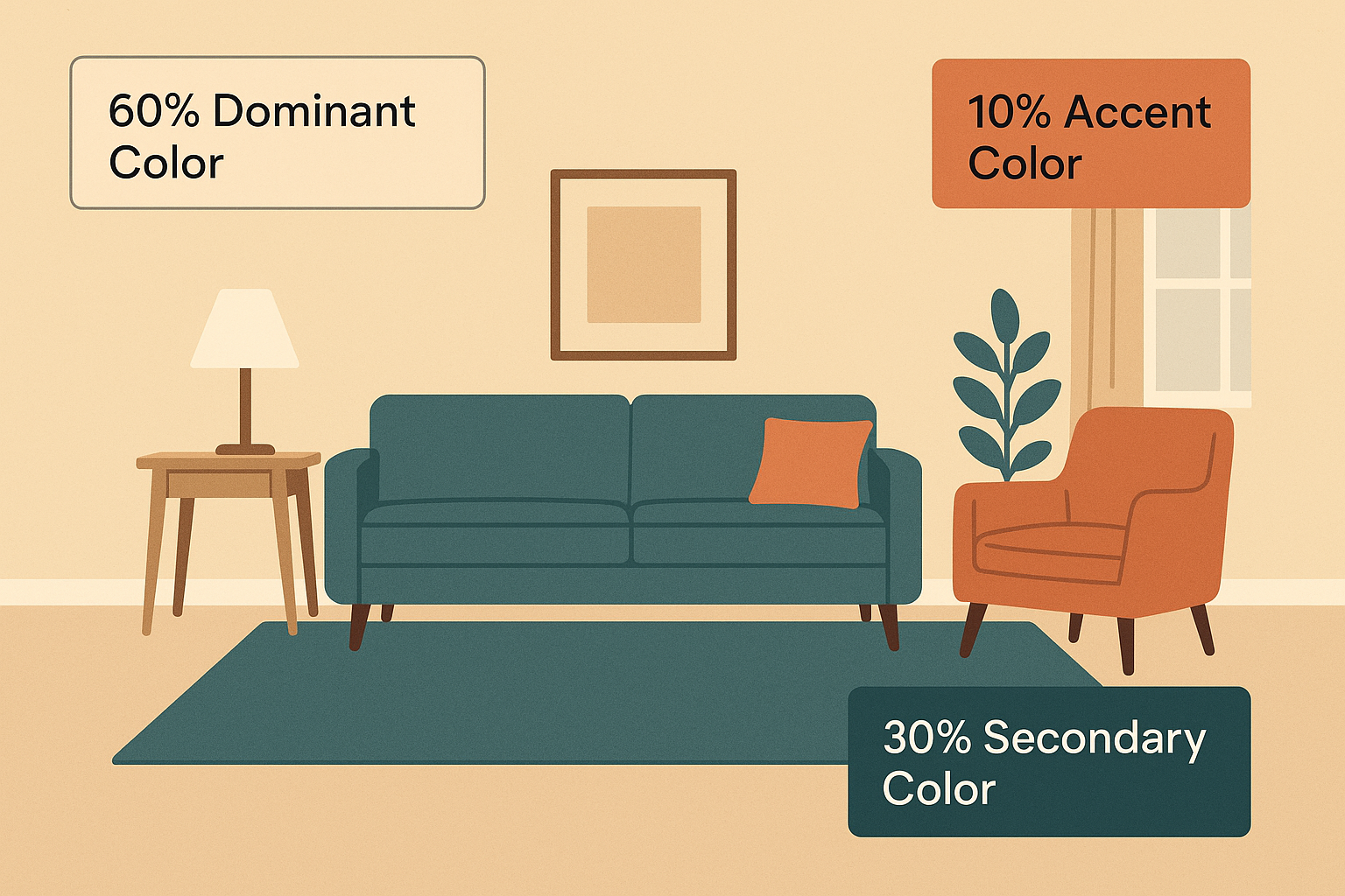
Once you’ve chosen your palette, balance it using the 60-30-10 rule:
60% Dominant color – Walls, rugs, large furniture
30% Secondary color – Furniture, curtains, bedding
10% Accent color – Art, cushions, decor items
Bold takeaway: This ratio creates visual harmony and avoids chaos—even if you use bold colors.
Pro Tip: Vary your hues within each color group. If blue is your dominant color, mix navy, slate, and sky tones to create depth and cohesion.
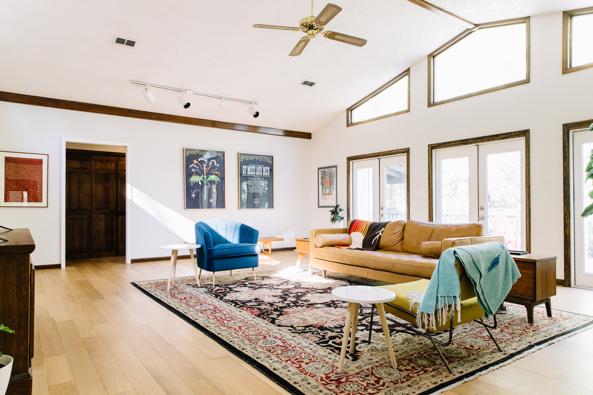
Here’s a designer secret many DIYers miss: Muted (earthy) colors and clear (bright) colors usually don’t play well together.
A crisp turquoise next to a muddy olive can make both look off. Why? Because they belong to different saturation families.
Bold takeaway: Pick either clear/bright or muted/earthy tones as your foundation, and stick with it.
If you do want to mix, follow this rule:
Let one saturation group dominate.
Repeat the minority color in small accents to make it feel intentional.
Example: A mostly earthy room with pops of a bright coral repeated in throw pillows and artwork.
Muted vs. clear is different from warm vs. cool. Even within one saturation family, you still need temperature balance.
Too many cool tones = sterile, lifeless
Too many warm tones = heavy, stuffy
Try an 80/20 ratio of warm to cool (or vice versa), and use neutral tones as a bridge.
Bold takeaway: Your space should feel balanced, not icy or overheated.
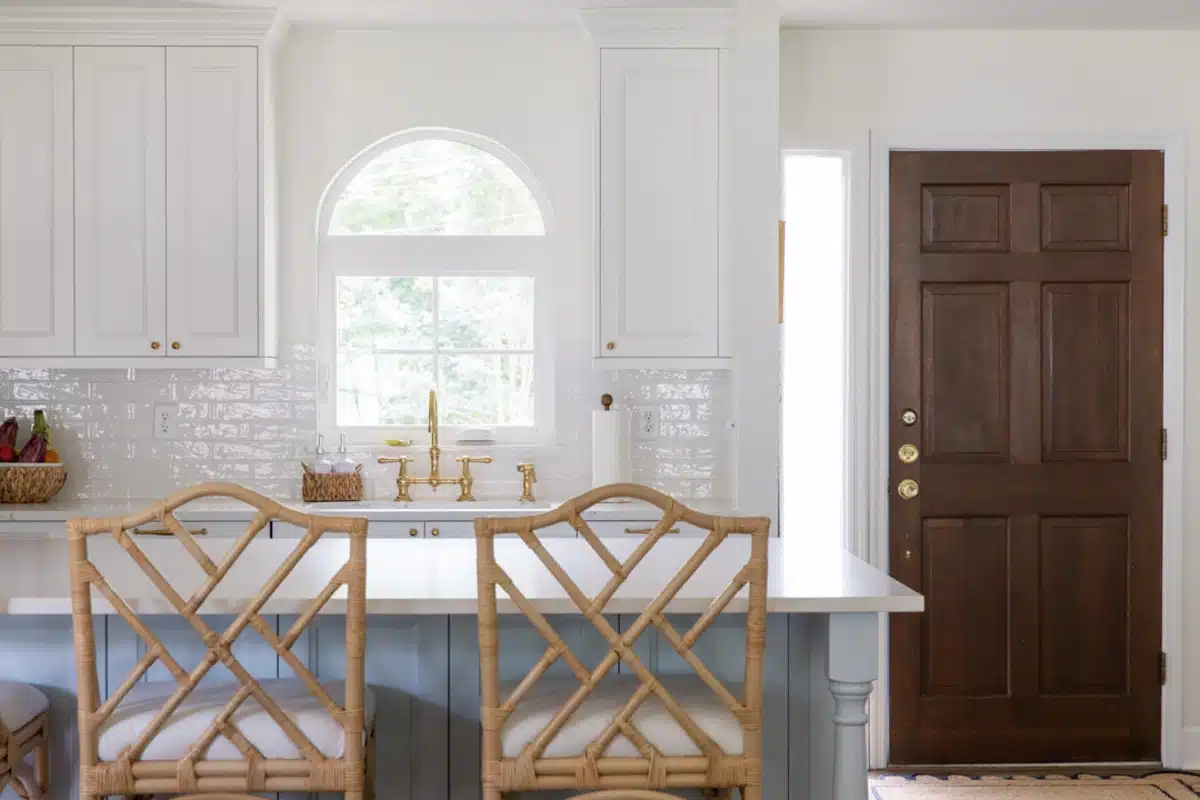
Common combo: Cool white walls + warm wood accents = inviting contrast.
Start small. Pick one room, use the 60-30-10 rule, and build from a piece you love—like a rug or piece of art.
This guide was brought to you by McManus Kitchen and Bath, where we believe your home should reflect your personality, not just trends. If you're ready to create a space that feels like you, we're here to help.
Schedule a Design and Budget Consult
What you'll get:
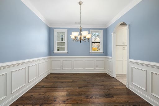
Light blue is a versatile and calming color that evokes feelings of tranquility and peace. It is often associated wit…
Homes that feel high-end are built on a handful of interior design principles, not trends.
What you’ll get:
A personal design consult in our showroom
3D drawings to help you visualize options
A ‘good-better-best’ estimate