
Designers and influencers call it color drenching, and many claim that if you don’t do it, your home will look dated. But before you grab a gallon of paint and commit to coating every inch of your space, there’s something you need to understand.
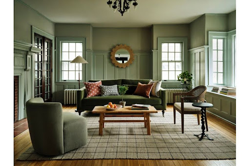
Color Drecnhing is a popular trend that creates a mooody atmosphere
but it does not work in all rooms or situations.
Scroll through Pinterest or Instagram for five minutes and you’ll see it everywhere: rooms wrapped entirely in one rich, moody color.
Walls, trim, doors, even ceilings all painted the exact same shade. Designers and influencers call it color drenching, and many claim that if you don’t do it, your home will look dated.
But when you change your trim and doors you’re making a whole-house commitment that can be costly and difficult to undo.
In this guide, you’ll learn:
Color decisions like this don't exist in a vacuum — they work best when they're part of a bigger design framework. Our interior design principles guide covers the fundamentals that make bold choices land well, rather than feel like a trend you'll want to paint over in a year.
This post was inspired by one of our favorite color experts: Marie Killiam. We often use her color organizing system (based on undertone) to help our clients choose the perfect colors for their home.
If you’d rather watch than read check out this video from Maria Killiam on this topic: Colour Drenching? What to Know Before You Try It
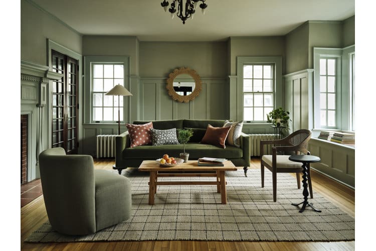
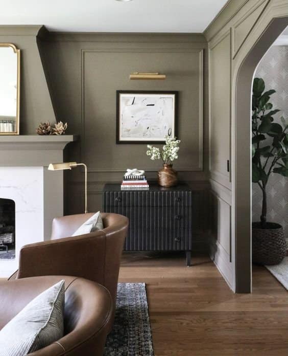
Color drenched wainscoting and window trim. The walls are a slight lighter shade.
Colour drenching is the practice of painting:
.... all the exact same color.
Instead of the traditional contrast between white trim and coloured walls, everything blends together into one continuous tone.
Done well, it feels dramatic, intentional, and high-end. Done poorly, it can look flat, unfinished, or painfully trendy.
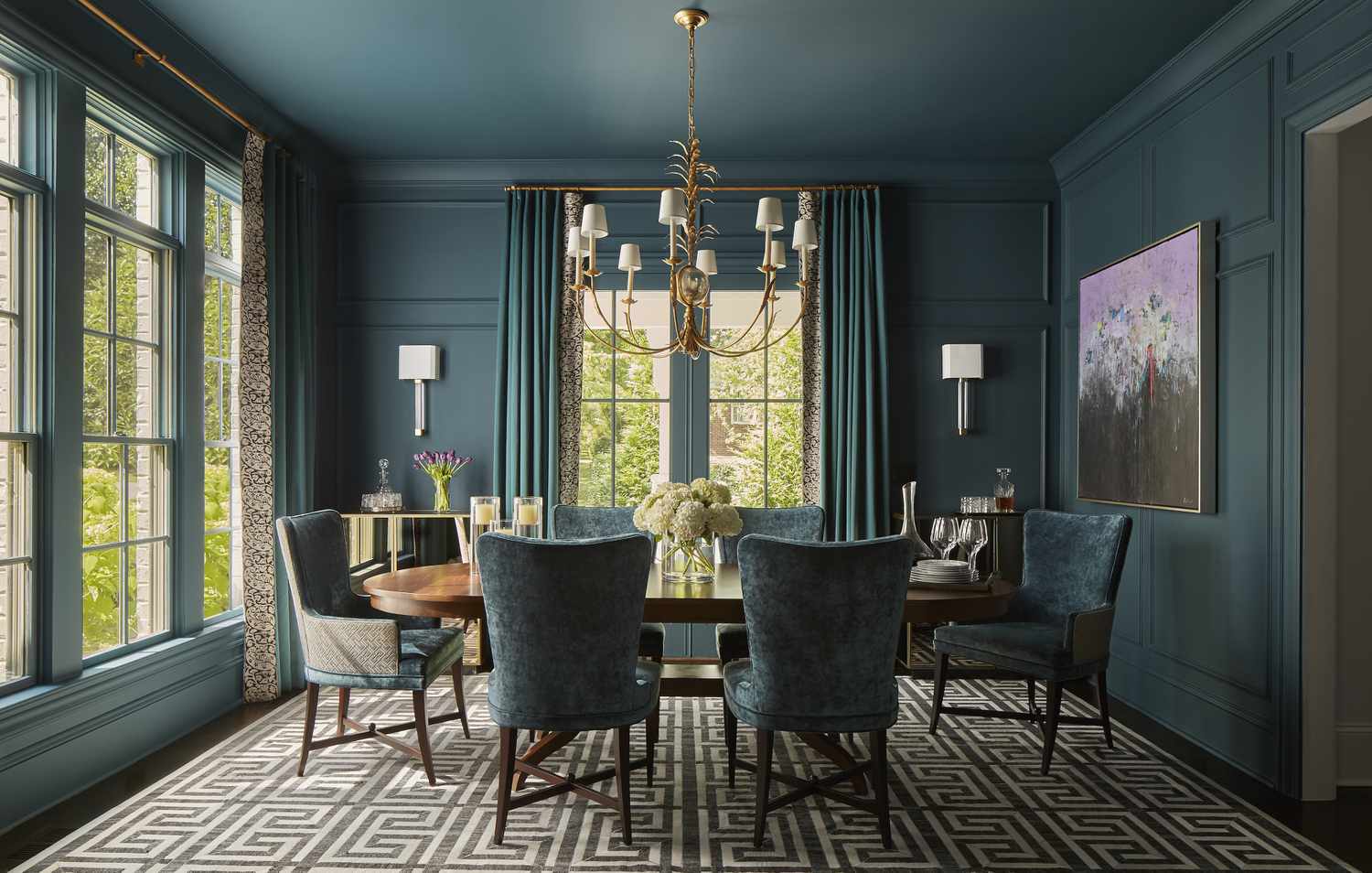
When should you color drench a room? Here are 3 places where it usually makes sense.
Color drenching looks incredibly expensive in rooms with genuine architectural detail.
Things like:
When you paint detailed millwork the same color as the walls, shadows and dimension create natural depth. The color unifies everything while the architecture provides contrast.
They key is that the the architecture does the visual work. Without that detail, there’s nothing for the eye to grab onto and the room can look flat and cave-like.
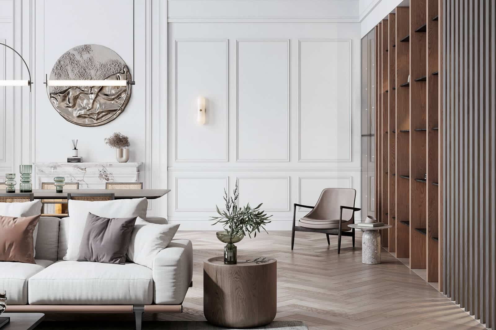
Color drenching works well in rooms with lots of trim and molding. The shadows and lines created by the trim add interest and the unified color creates the mood.
Enclosed spaces are ideal candidates for color drenching:
Because these rooms have clear stopping points, the color doesn’t need to flow into the rest of your home. You’re making a bold choice, but it’s contained.
It feels intentional, not overwhelming.
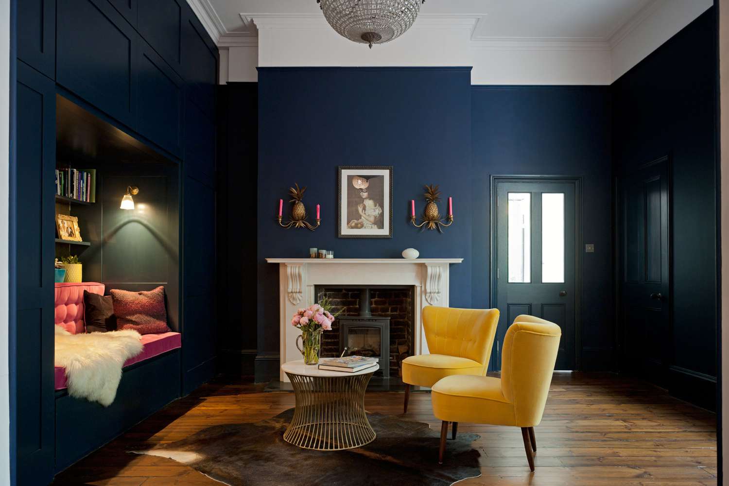
Whole this room is not completed color drenched the the walls, doors and trim are painted to match, creating the mood. Because there is not a lot of molding the white ceiling and fireplace help add interest and contrast.
Sometimes color drenching isn’t about drama, it’s about disguise.
It can be a lifesaver if you have:
Painting everything one colour minimizes contrast and hides flaws. If there’s nothing worth highlighting, blending it away can be the smartest move.
Now let’s talk about where this trend can go very wrong.
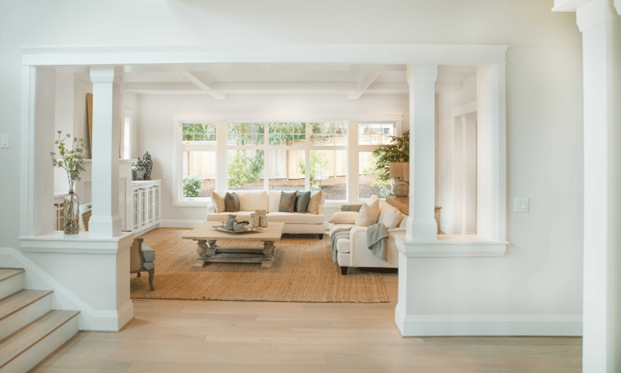
In open concepts it's hard to color drench because there is no easy stopping point.
If your trim runs continuously throughout your main floor, colour drenching one area often means committing to all of it.
That’s not a small project.
Repainting an entire home’s trim can cost tens of thousands of dollars in labour alone. Trim requires sanding, priming, detailed cutting, and multiple coats.
Once you paint all the trim in your home reversing it is expensive and disruptive. Make sure you love the colour and that it works in every room.
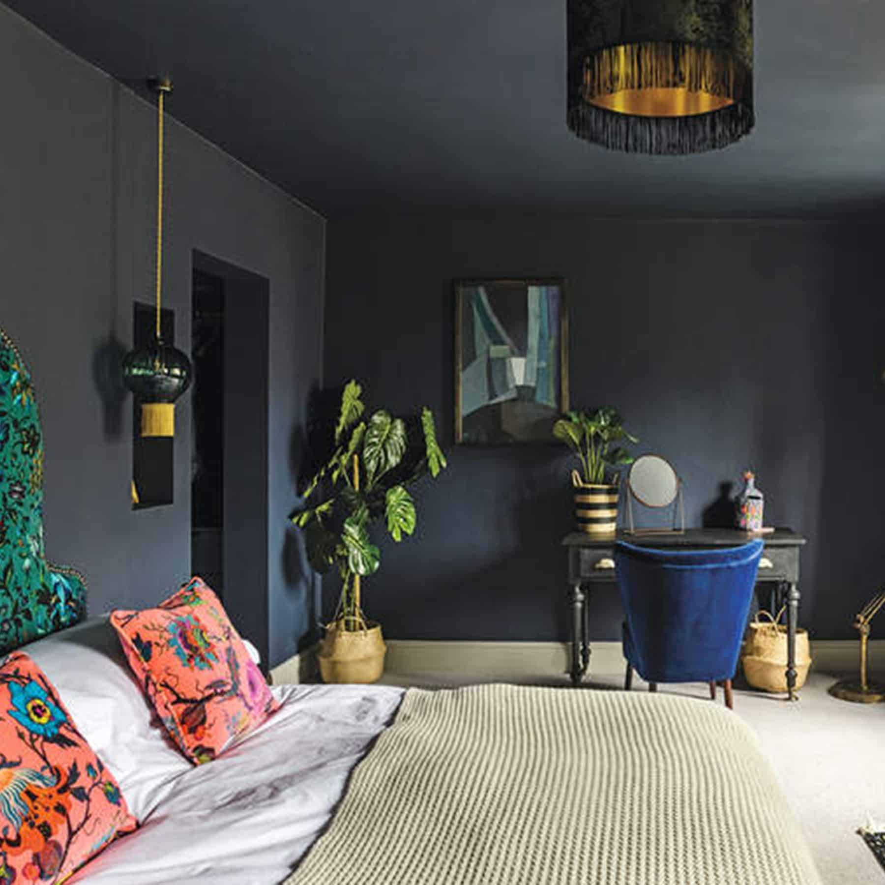
In a standard room with:
…removing contrast can leave the space looking flat and cave like. Instead of feeling moody and layered, it can look like a renovation that stopped halfway.
Contrast is what creates visual interest and if the architecture doesn’t provide it, color alone won’t save it.
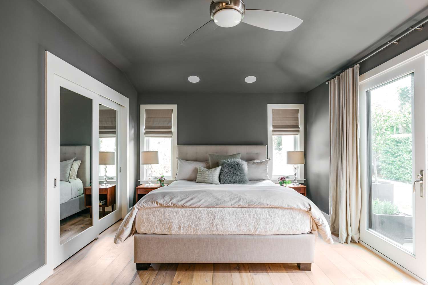
When color drenching the wall make sure all the colors of the room coordinate well togeher.
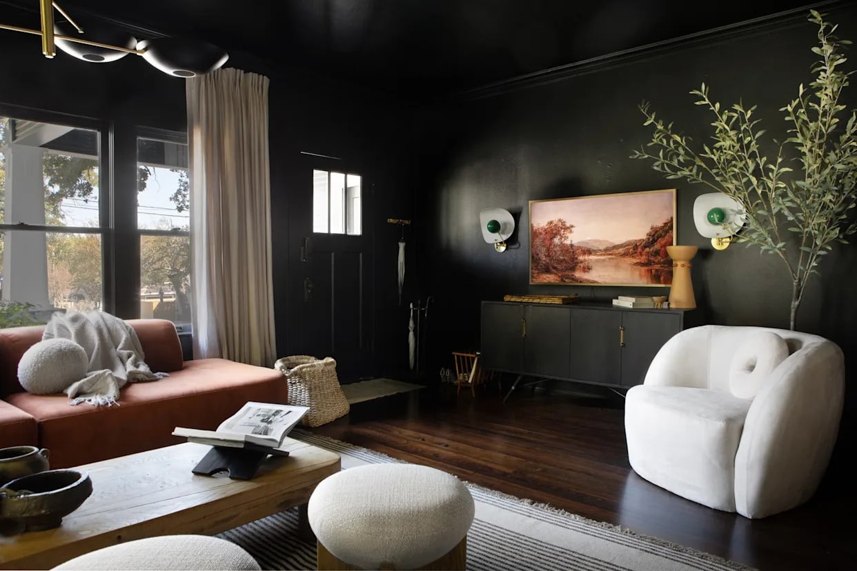
White trim can quietly rescue a slightly “off” wall colour and tie a room together even if the rest of the decor is a little off. When everything is the same shade, there’s nowhere to hide.
If your paint clashes with fixed elements like:
…the mistake becomes amplified. Color drenching magnifies color undertone issues instead of softening them.
Before committing, always compare your paint colour to your fixed finishes in multiple lighting conditions.
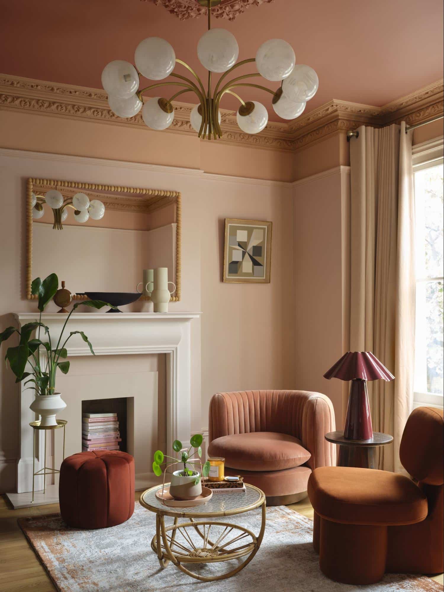
Rather than color drenching a room consider color capping... painting the ceiling a coordinating shade.
If you love the drama of color drenching but aren’t ready to repaint your trim, consider color capping.
Color capping focuses on the “fifth wall” in the room... the ceiling. Instead of leaving a stark white ceiling against dark walls (which can feel harsh and choppy), you:
In rooms with lower ceilings, it prevents that bright white line from cutting across the top of the walls — helping the space feel more cohesive and intentional.
You get mood and dimension without the commitment of painting all the walls and trim.
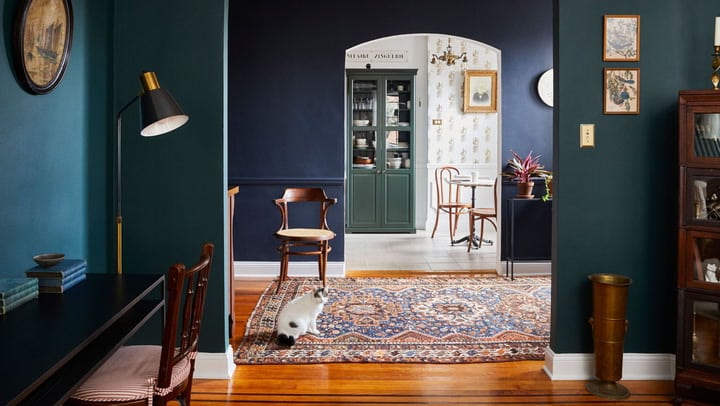
Color drenching is not mandatory. It’s not a design requirement. And it’s definitely not a universal “slam dunk.”
It works beautifully when:
It’s risky when:
The golden rule? Your paint colour must relate to the fixed elements in your home before you commit to changing the envelope. Trends come and go. Your flooring, tile, and countertops don’t.
If you’re considering color drenching test large samples, compare them to your fixed finishes, and evaluate them in morning, afternoon, and evening light.
Because when it’s done right, colour drenching feels intentional and elevated. But when it's done wrong it can be expensive to fix.
It starts with clear, accurate pricing


Decorating and designing are very different things. Trends are mostly about decorating, and some trends are actually …
Homes that feel high-end are built on a handful of interior design principles, not trends.
Someone shared something recently that stuck with me. They said they didn't realize how many small annoyances they ha…
What you’ll get:
A personal design consult in our showroom
3D drawings to help you visualize options
A ‘good-better-best’ estimate