Why Is Choosing Paint Colors So Hard?
We choose everything in design. By making all our selections in advace we can order everthing early, have a precise scope of work for our trade partners and it generall makes projects run smoother and on time.
The exception though is paint colors. Paint colors are hard to choose in the showroom because there are so many factors that impact how that color looks in your home.
Some colors are of course are decided in advance. Your cabinet colors, countertop colors, tile and flooring colors are all fixed.
Choosing wall, ceiling and trim colors is hard to do in the showroom because colors look different in different lighting and because of the other materials / colors around them.

Why Paint Colors Don’t Match
Another issue that comes up is paint colors not matching when they are painted on different surfaces or even different walls in the same room.
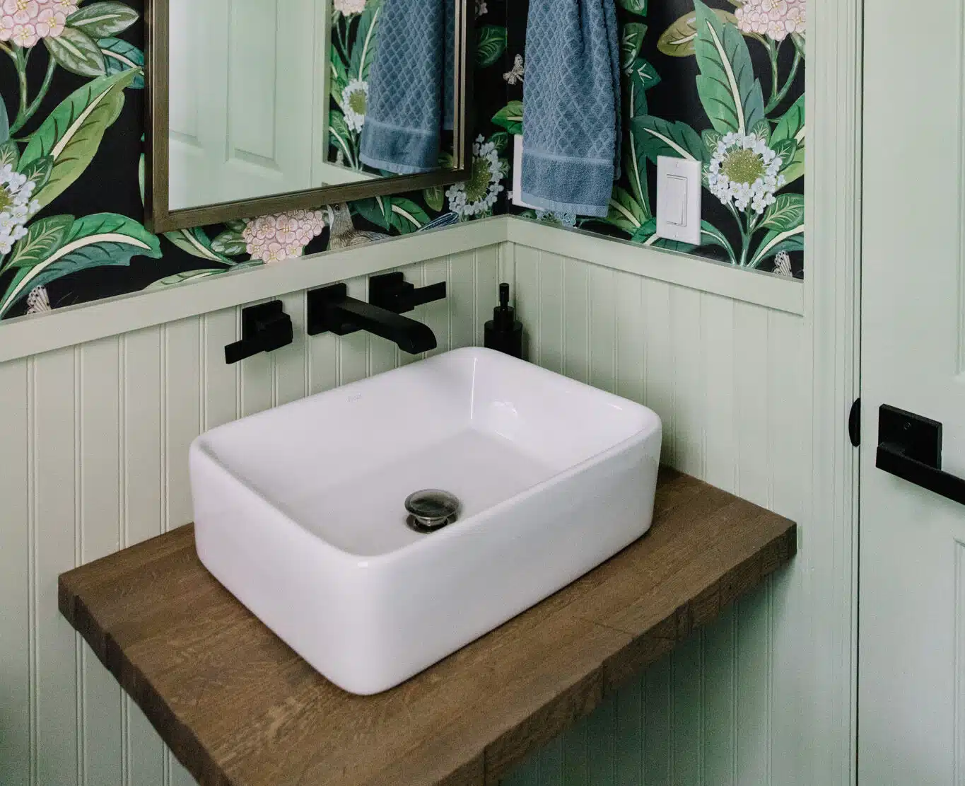
Paint color is affected by material texture, light source and adjacent colors. So even if you use the same paint color on your cabinets and trim they may not look exactly the same.
Paint colors can also change througout the day as the natural light in a room changes. As the sun rises and sets it will change the quality of light in the room and accent difference surfaces.
You might get direct sunlight in the morning but by the afternoon the sunlight is being filtered through tree cover so the light has a diffference quality to it.

How to Choose Paint Colors
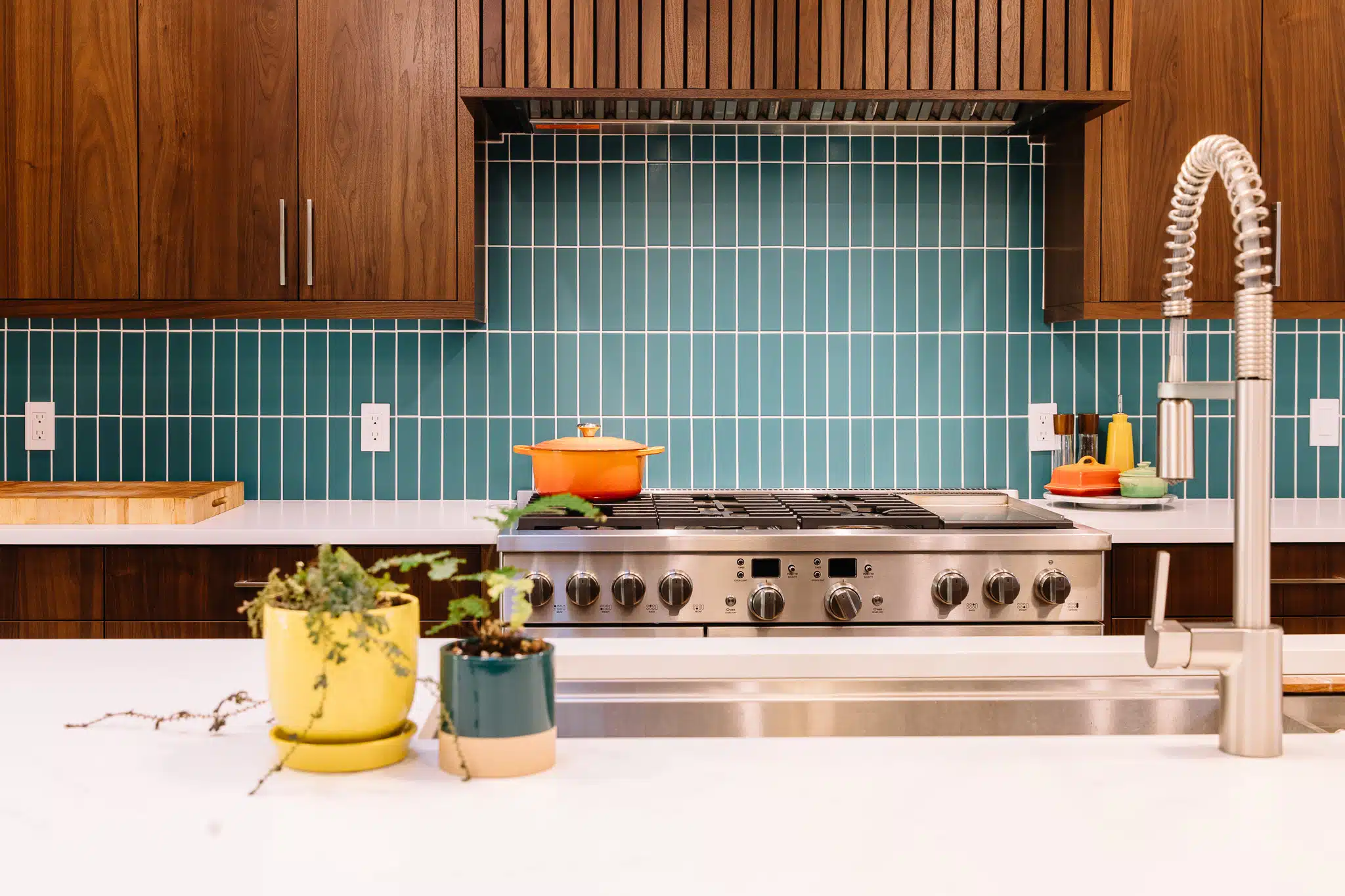
In general its important to have a focal point in a room. In a kitchen the focal point if often the range/range hood or island. But it can be the countertops of backsplash or other elecment as well.
A room can have one or two focal points, more than that and it can feel busy or chaotic. An exception can be made for large rooms where different activities happen in different areas. Each ‘activity area’ can have its own focal point as well to help define the area.
Once you know your focal points(s) you can start to think about the rest of the colors in the room. They can accent, match or contrast the focal point colors but you want to first match the undertone of the color.
Match the “Undertone”
Colors have an undertone to them. Usually we refer to the undertone as ‘warm’ or ‘cool’ or ‘neutral’ but some people will use undertone colors like “beige, blue, green etc…
Undertones are the reason you can look at color in the showroom and think its a neutral grey but when you get it home it has a blue hue to it. Seeing the undertone in a color takes experience and practice but an easy way to see it is to pick 6-8 colors that are similar to the color you like and lay them next to each other. The undertone usually becomes obvious.
In general all the colors in the room should have similar undertones. Cool tones go with cool, warm tones go with warm etc… There are some neutral tones like Greige (a mix of grey and beige) that can go with both.
